Hi there,
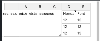
I’m using the comment plugin and I face a very down-to-earth issue : comments are always displayed on the right of the cell, however when my table is taking the whole screen, the right-most cells comments are cut out.
Is ther a way to fix this (either by placing the comment on the left of the cell or with some magic option I do not know about?)
Thanks !
Hi @gregoire.spiers
This issue seems to be related to your container’s CSS settings. For example here Handsontable example - JSFiddle - Code Playground when I shink the window the comment is placed on the left side as it is the only way for it to show.
This behavior was fixed some time ago so also check if the issue is replicable using the latest version of Handsontable - 12.3.3.
1 Like
Thanks @aleksandra_budnik,
We are still on version 10, I guess uprgading to a more recent version should probably do the trick
I hope this will solve the issue. But if not, please feel free to send us a demo for issue replication at support@handsontable.com

