Hi ,
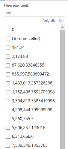
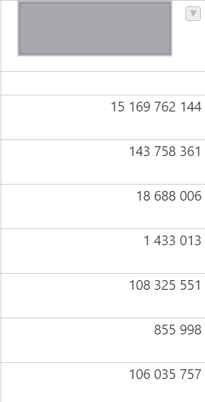
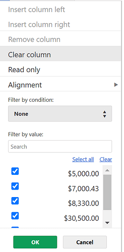
We’ve recently started using dropdown filtering along with currency columns in our system. Some of these columns are calculated values displayed in the grid. However, users have reported an issue where they see many decimals, even though the columns are supposed to be rounded to four decimal places.
The column configuration is:
/* 10 */ {
data: ‘currencycolumn’,
renderer: this._currencyRenderer,
type: ‘numeric’,
numericFormat: {
pattern: ‘0 0,00’,
culture: ‘nb-NO’,
},
validator: this._numberValidator,
},
This is how it looks in the grid:
Any guidance on resolving or troubleshooting it would be greatly appreciated.
Thanks in advance for your help!
Hi @jlsuarezcabrera
In version v14.2.0 (with this pull request List of filtered values should show the formatted numeric value not the source data by jansiegel · Pull Request #10756 · handsontable/handsontable · GitHub) we applied formatting to values visible in the filter by value list.
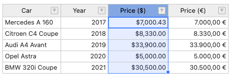
Here’s a demo Handsontable example - JSFiddle - Code Playground
We can see here that there’s a value of 7000.4324324
{ car: 'Mercedes A 160', year: 2017, price_usd: 7000.4324324, price_eur: 7000 },
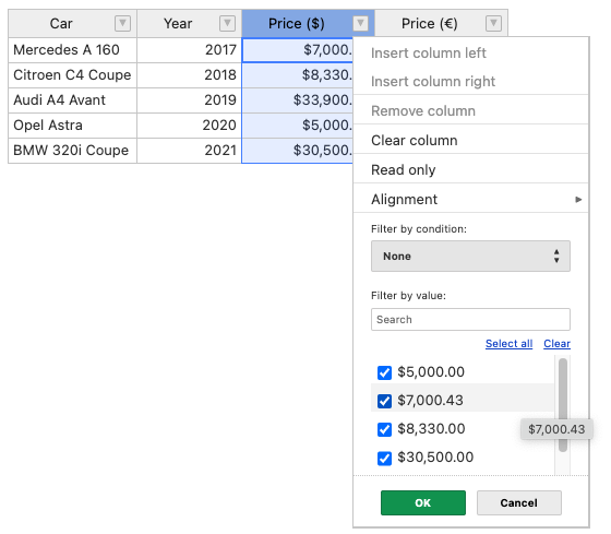
and we use formatting to cut it to 2 decimal places
and this is also what we see in the filter list
Do you use an older version than 14.2.0 or have a different setup?
Hi,
Yes I am using latest version:
"@handsontable/react": "^14.2.0",

"handsontable": "^14.5.0"
I can´t see sort of important differences, except by numbro. Is it something I should consider?
No, not really. The issue has to be within the configuration.
Do you use a custom cell renderer to cut those values or the numeric format? If you could prepare a demo, that could also help to specify the cause of the issue.
Hi 
Yes, we use this:
export function formatBase(amount: number, decimals?: boolean, numberOfDecimals?: number) {

  const numDecimals = numberOfDecimals ? numberOfDecimals : 2;

  const maximumFractionDigits = decimals ? numDecimals : 0;

  const minimumFractionDigits = decimals ? numDecimals : 0;

  const formatOptions = { minimumFractionDigits, maximumFractionDigits };

  const replace = amount > -10000 && amount < 10000 ? '' : ' ';

  return amount.toLocaleString('en-GB', formatOptions).replace(/,/g, replace).replace(/\./g, ',');

}
And setting the innerHTML of the cell:
td.innerHTML = format(

        value,

        this.props.numberFormat,

        this.props.showDecimals,

      );
Also, I was wondering if there is a way to align to the left the numeric dropdown filters and to right the text ones. Thanks 
Could you please apply the logic to this demo https://jsfiddle.net/fLh0ke89/ ? within the filters we still have the number from the format but applied cell renderer in the table.
Hi Aleksandra,
I was able to fix this using the method: modifyFiltersMultiSelectValue and also got some code from the PR mentioned in your previous answer.
private _modifyFiltersMultiSelectValue(value: string, cellProperties: CellProperties) {
    let newValue = value;

    if (cellProperties.type === 'numeric') {


      if(isNaN(newValue))

        newValue =  "0";

      if (isNumeric(newValue)) { // HERE I'd copy the logic from the renderer, or I can suggest moving it to a separate helper

        const numericFormat = cellProperties.numericFormat;

        const cellCulture = numericFormat && numericFormat.culture || '-';

        const cellFormatPattern = numericFormat && numericFormat.pattern;

        const className = cellProperties.className ? cellProperties.className.toString() : '';

        const classArr = className.length ? className.split(' ') : [];

        if (typeof cellCulture !== 'undefined' && !numbro.languages()[cellCulture]) {

          const shortTag = cellCulture.replace('-', '');

          const langData = numbro[shortTag];

          if (langData) {

            numbro.registerLanguage(langData);

          }

        }

        numbro.setLanguage(cellCulture);

        newValue = numbro(newValue).format({ thousandSeparated: true, mantissa: this.props.showDecimals ? 2 : 0 });

      }

    } else {


    }

    // PLACE FOR OTHER CELL TYPES

    return newValue;

  }
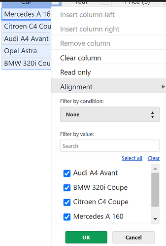
I was wondering if it is possible to align, text options to the left:
And options of numeric columns to the right in the dropdown:
Thanks

I’m glad to hear that the main issue is solved.
To align the text of only some of the values (number versus text), you’d need to alter the code of the plugin (as that would require attaching classNames (or style="text-align: right") to the TD elements within the menu.
Using CSS you could do this by applying
.htUIMultipleSelectHot TD {
  text-align: right
}
but that changes all of the value - not only those that are numeric. Demo: https://jsfiddle.net/z2k6gos7/
I found a way how to perform a conditional style for a dropdown filter menu for numeric columns using
                    afterDropdownMenuShow={(instance: DropdownMenu): void => {const filters = instance.hot.getPlugin("filters");

                    const selectedColumn = filters.getSelectedColumn().physicalIndex;

                    const columnMeta = instance.hot.getColumnMeta(selectedColumn);

                    const dropdownMenu = document.querySelector(".htUIMultipleSelectHot.handsontable");

                    if (dropdownMenu) {

                      const dropdownClasses = dropdownMenu.className;

                      // Add or remove the "numberFilter" class based on column type

                      if (columnMeta.type === "numeric") {

                        if (!dropdownClasses.includes("numberFilter")) {

                          dropdownMenu.className += " numberFilter";

                        }

                      } else {

                        if (dropdownClasses.includes("numberFilter")) {

                          dropdownMenu.className = dropdownClasses.replace(" numberFilter", "");

                        }

                      }

                    }
Also I added this css
/* Ensure the label takes full width */

      .numberFilter .htCheckboxRendererLabel {

        display: flex !important; /* Use flexbox for layout */

        justify-content: space-between !important; /* Push content to opposite ends */

        align-items: center !important; /* Align items vertically */

      }

      /* Optional: Add spacing between checkbox and text */

      .numberFilter .htCheckboxRendererInput {

        margin-right: 8px !important; /* Adjust spacing as needed */

      }
Thank you so much!
That’s awesome @jlsuarezcabrera
Thank you for sharing the result 
1 Like
