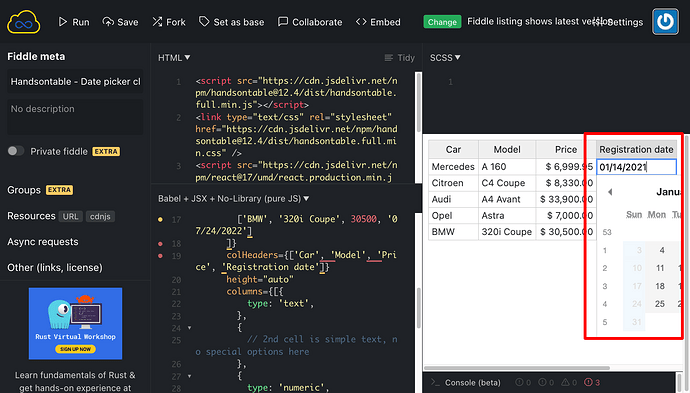
Under certain scenarios, we are experiencing the Date picker getting visually clipped (or overflowing its container).
In this example, a date column is the last in the table, and the table itself has width constraints applied. The resulting date picker ends up overflowing its container and causes a horizontal scrollbar in the browser.
Please see this JSfiddle (you may need to reduce the size of the output pane to emulate the issue):
ideally, HoT would determine if there is available screen space and set the anchor/orientation point for the date picker as bottom-right of the cell rather than bottom-left.
Any help appreciated, thanks.
Hi @blake.gilchrist
Thank you for contacting us. We are aware of this issue, and it’s already reported here: https://github.com/handsontable/handsontable/issues/8912
It’s not on our roadmap yet.
Hi Adrian,
Thanks for the quick reply. We’re an existing HoT customer and this issue has been raised by our end users. Our table columns are user-definable so as the software/UX designers we don’t always have control over the column order, hence it being something we can’t solve from our end.
We appreciate that trying to get HoT to automatically determine the correct orientation point for the date picker based on numerous factors outside of its control can be difficult. Perhaps a configuration option could be added to the Date cell type to allow us to set the orientation point (e.g. bottom-left, bottom-right) as needed?
Thanks.
Hi @blake.gilchrist
I understand. Can you please add your ideas to the GitHub issue I linked? It might be useful for our developers when they start working on solving it.
