How to set table width based on its content?

Tags: #<Tag:0x00007f51b4e69620> #<Tag:0x00007f51b4e694e0>

Hi. I have two types of tables: a static one, for which the width is specified, and a dynamic one, to which columns can be added in a certain way. Because of this, I initially do not know what the width of the table will be. And in connection with this, unpleasant moments arise. The static table has a vertical scrollbar next to it with the indent I need. And if another component is located next to this table (for example, like the graph here), then there are no problems with the layout.
The dynamic table has a vertical scrollbar that goes to the right, since the table does not have a fixed width and takes up the entire available width in the parent container. And if there is another component (again, a graph), then the layout breaks.


Fixed width table displays correctly if there is another element in the container


Is there any way to solve this problem? Some kind of hook?
I noticed that the div container with the wtHider class is set with the actual width of the table

I tried to do it this way. It seems to work. What do you think?

    const updateTableWidth = (hot: Handsontable) => {
      if (!hot) return

      const SCROLLBAR_MARGIN = 14

      const wtHider = hot.rootElement.querySelector('.wtHider')
      if (wtHider && wtHider.clientWidth > 0) {
        hot.updateSettings({
          width: wtHider.clientWidth + SCROLLBAR_MARGIN,
        })
      }
    }

And use it in hook

        afterInit: function (this: Handsontable) {
          updateTableWidth(this)
        },

Hi @mr.fursy

In general, if the width and height options aren’t set to the fixed values the table will spread in the viewport accordingly to its content. Without code demo I can’t tell for sure what your use case is, but if the solution you came up with works for you that’s great.

My implementation has the following problem.

When initializing a table that does not fit into the container in width and height, the vertical scroll is not displayed, since it is set at the end of the table. If I edit a cell, the horizontal scroll position is reset to the beginning of the table and a vertical scroll will also appear, inherent in the container itself, into which the table does not fit in width. Later, when editing, the scroll position is not reset.

The goal I am trying to achieve is that I have a dynamic table in width, which can have any number of columns, I want the table width to be set “in fact”, so that the vertical scroll is next to the table. But if the table does not fit into the parent container, then the scroll should be on the acceptable border of this container, and not at the end of the table, which can only be reached by scrolling the horizontal scroll. And so that the horizontal scroll position is not reset when editing.

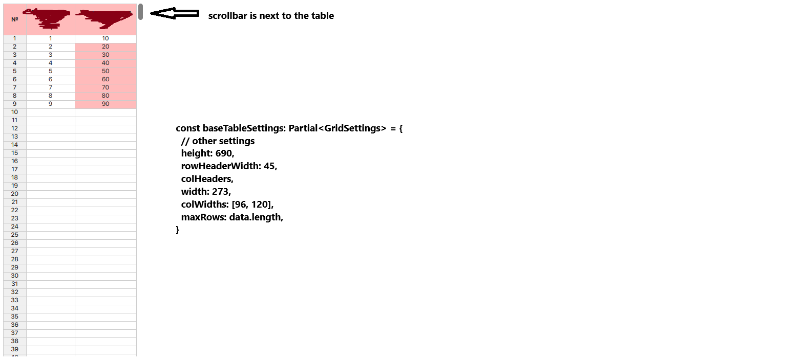
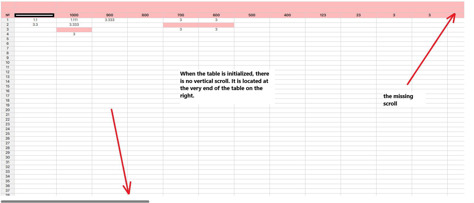
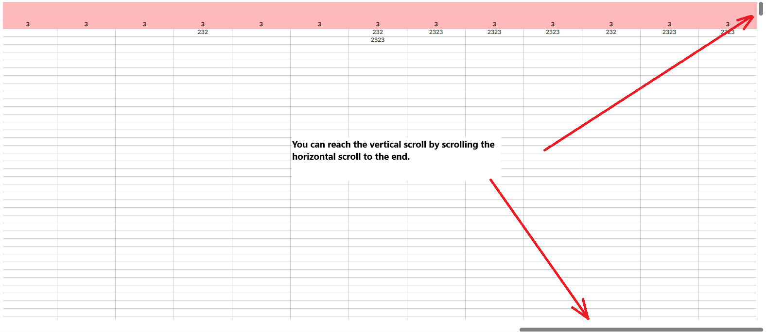
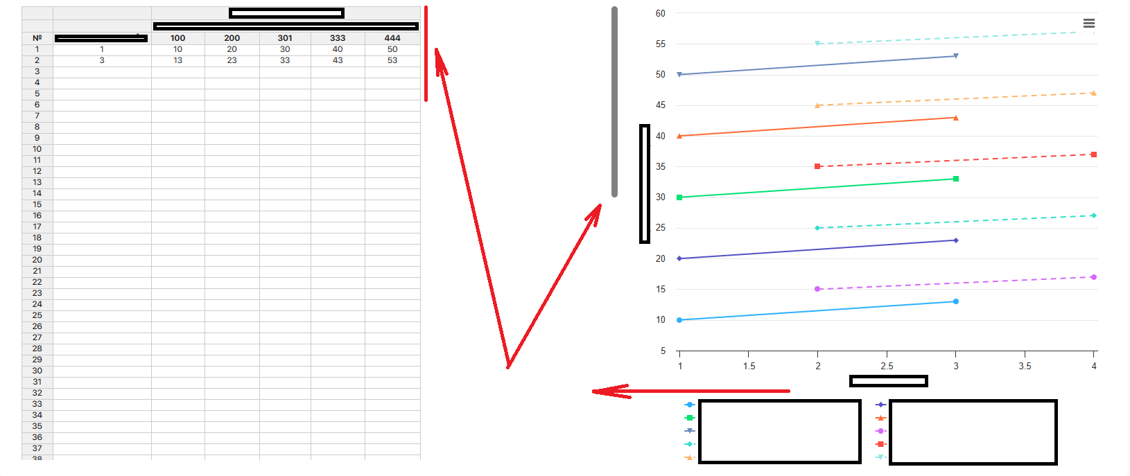
This is what I want. If my table width does not fit into the specified allowed values ​​(in this case, the table should take up no more than 55% of the width of the container in which it is located together with the graph), then a horizontal scroll appears and a vertical one (if necessary).

But if my table in actual width (in terms of content) is less than the maximum values ​​(less than 55% of the width of the parent container), then it should not stretch, leaving empty space and drawing the vertical scroll away from the table and eating up some of the space near the graph. The vertical scroll should be located next to the table, and the graph should take up all the space available to it.


@adrian.szymanski @aleksandra_budnik Could you suggest ways to solve this problem? It seems trivial.

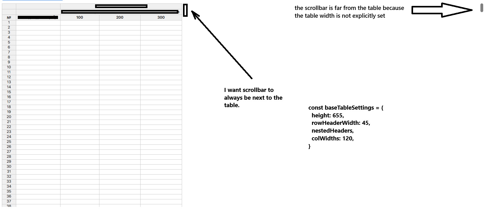
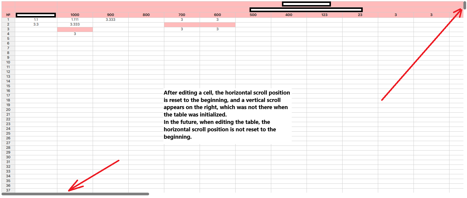
upd. I made such an implementation. I gave up the idea of ​​setting the width for the table itself in the afterInit hook, now I set the width for the container in which the table is. This way, side effects associated with the disappearing scroll and resetting the scroll when editing disappear.

It looks hacky, since there is a direct call to the DOM

/**
 * Sets the width of the table container according to its actual width on the page.
 *
 * The function takes an instance of Handsontable and adjusts the width of the container 
 * with id="spreadsheetContainer" so that it matches the width of the inner `.wtHider` container 
 * with a small additional margin. This margin (`SCROLLBAR_MARGIN`) is necessary to ensure that 
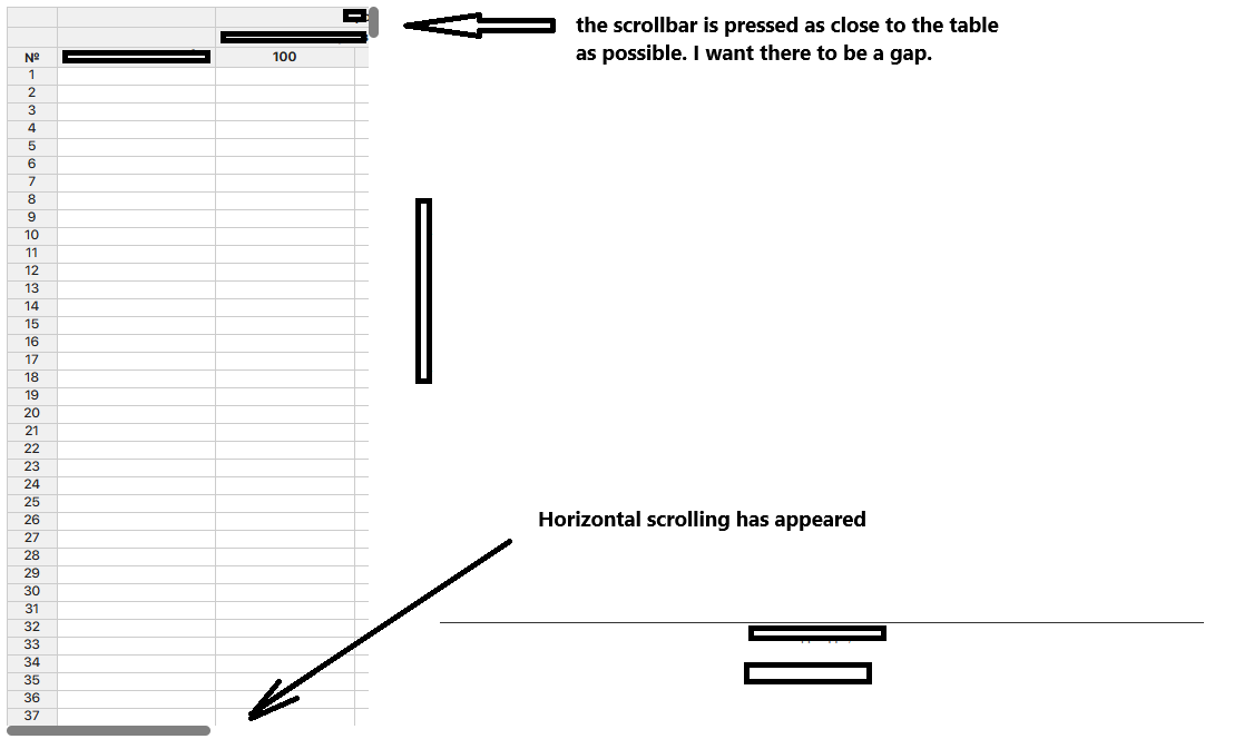
 * the vertical scrollbar does not stick too close to the table, leaving a small visual gap, 
 * and also to prevent the appearance of a horizontal scrollbar.
 *
 * @param hot - the Handsontable instance for which the width needs to be updated.
 */
const updateTableWidthContainer = (hot: Handsontable) => {
  if (!hot) return;

  const SCROLLBAR_MARGIN = 12;

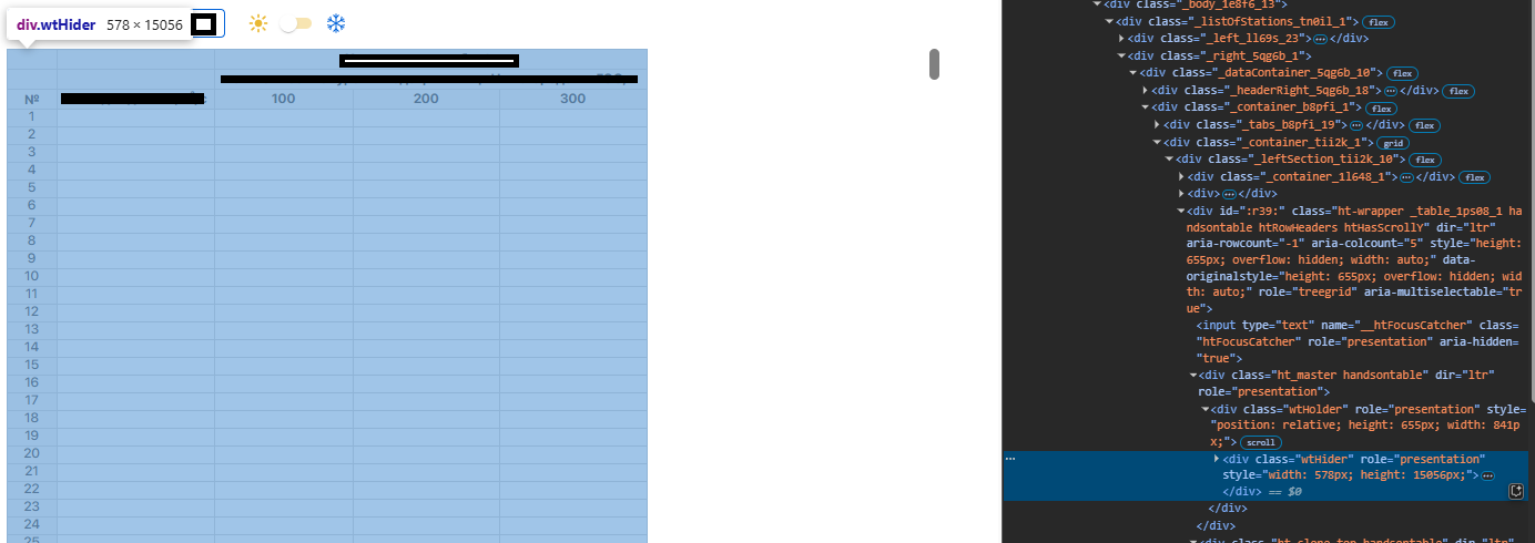
  const wtHider = hot.rootElement.querySelector('.wtHider');
  const spreadsheetContainer = document.getElementById('spreadsheetContainer');

  if (spreadsheetContainer && wtHider) {
    spreadsheetContainer.style.width = `${wtHider.clientWidth + SCROLLBAR_MARGIN}px`;
  }
};
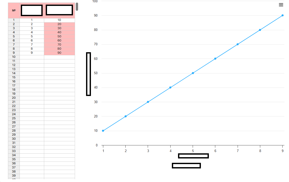
  const baseTableSettings: Partial<GridSettings> = {
    data,
    columns,
    rowHeaders,
    cell,
    afterChange: updateCharacteristicsSpreadsheetData,
    beforePaste,
    beforeAutofill,
    height: 690,
    rowHeaderWidth: 45,
    maxRows: data.length,
    afterInit: function (this: Handsontable) {
      updateTableWidthContainer(this)
    },
  }
<div className={cls.mainSection}>
  <div className={cls.spreadsheetContainer} id='spreadsheetContainer'>
    <TailraceCharacteristicsSpreadsheet />
  </div>
  <div className={cls.chartContainer}>
    <TailraceCharacteristicsChart />
  </div>
</div>