Hi,
I am having an index/row header misalignment on tables where the cell contents are long enough to cause a line break.
For example, my cell data is “12345678_myproject_2019-07-02T00-00-00.000000_username.txt” which is too wide for the column width so this is displayed as:
12345678_myproject_2019-07-02T00-00-
00.000000_username.txt
as expected. However, the cell containing the row index is shorter than the cell containing the data. This behavior repeats and soon the table index is considerably out of alignment. I tried removing our site CSS and still hit this issue. I am still including the Bootstrap 4.3.1 CSS which has been modified to scale to Bootstrap 3 dimensions - 14rem text instead of 16rem. I was having the same issue with Bootstrap 3 and an older version of HOT (v0.34?). How do I fix this alignment?
More details:
- The .ht_master.handsontable div has a table where the index th cell has dimensions 40 x 42 with a border of 1px and where the td cells have the same dimensions
- The .ht_clone_top.handsontable div has a table
The .ht_clone_left.handsontable div has a table where the tr dimensions for the misaligned row are 50 x 42 with no margin or border, the th dimensions are 41 x 40 with a border of 1px. This seems to be where I am getting the displacement
Here is a screen cap of the misalignment:

I also realized when posting the image that I am using a custom renderer for this cell and wrapping the contents in an anchor tag. I removed the custom renderers and left the cell data as is and still see the issue.
Hey @SHANE.OCONNOR
if you already using a custom renderer you can pack the file in a DIV container with a defined height to let Handsontable know how much space do you need.
Hi, @aleksandra_budnik.
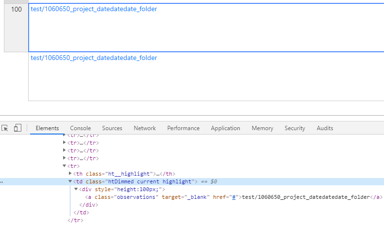
Apologies for taking so long to respond. I tried setting heights explicitly and saw the same misalignment. Here is an exaggerated example with the height set to 100px. This is an exaggeration but the rows become aligned by a whole row at the end of the 100 record table.
Without this explicit height setting, the row header and cells do align until a cell contains text that causes the cell to expand vertically. It’s the multi-line cells that seem to be causing the misalignment for me. I’d prefer to not have to set a defined height as I do not know a priori what a good value is here.
Finally, I noticed the class “observations” on the anchor tag in the screenshot. I did try removing that class but still see the misalignment.
Can you try to load the example into JSFiddle and check if it still broken?
I realize this is hard to debug without a repro case so I will try to get a JSFiddle next week. In the meantime, in case this helps:
I noticed that the demo-resizing example in the documentation works fine if I try to replicate the error which makes me wonder whether this is a CSS issue. In Chrome, when I inspect the th element of the “ht_clone_left handsontable” div in the HOT documentation, the element’s inline height e.g. ‘style=“height: 105px;”’ matches the Computed height in the Developer Tools. However, when I look at my table, I see an inline value of ‘style=“height: 63px;”’ but the Computed height is 62px. If I manually change the inline height to 64px, the computed height is 63px and the table cell is aligned. I do not know what is causing that discrepancy though. I cannot replicate the issue in your documentation example (which is a good thing!).
Hey Shane,
have you tried to comment out Bootstrap and check if it works the same? If you already tried to remove the renderers maybe it’s Bootstrap.
There’s no update for more than a week so I guess that we can close the issue.
If there’s still something I can help you with please send me an email at support@handsontable.com

