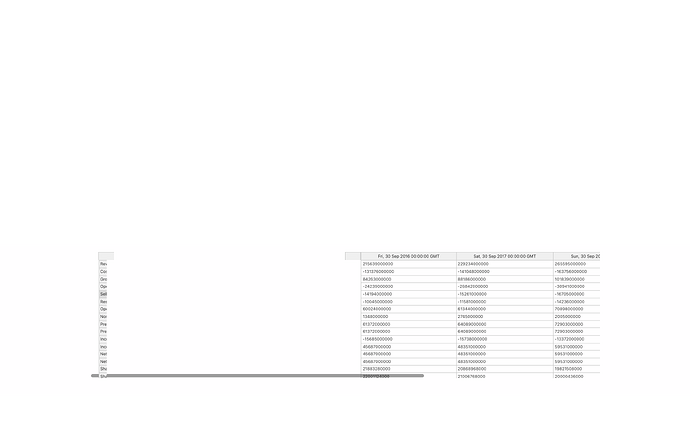
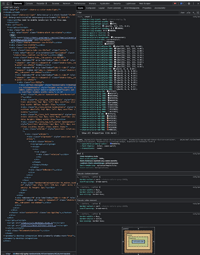
I am having the following issue with Handsontable, for some reason it renders this gap between the first and second column, and also shortens the first column’s width. For context I did not make any changes to the CSS, and I am using the Chakra UI react library. Grateful for any advice on this issue!
Hi @mariothomas
Can you please share the output CSS from browser console for Handsontable object and its parent object?
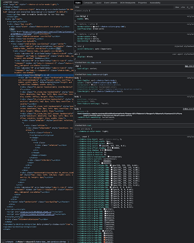
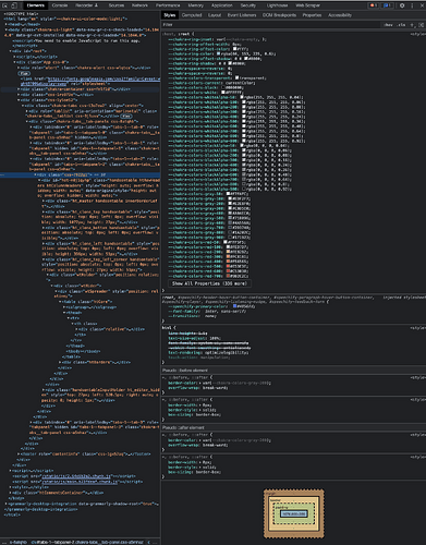
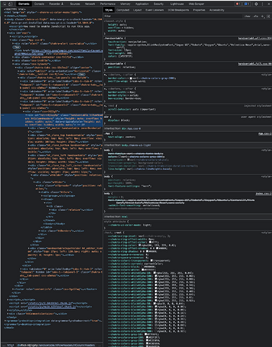
Thanks for the note! I have attached all the CSS output from the parent object and the Handsontable object. Please let me know if the URL of my demo would also be helpful. Grateful for your help!
Parent Object:
Handsontable Object:
Hi @mariothomas
Thank you for that. Yes, the code demo also would be helpful.
Absolutely, @adrian.szymanski, this is the url -> https://investing-bot-1.herokuapp.com/, and if you type “aapl” into the search bar the table should appear. Very grateful for your time!
Hi @mariothomas
Thanks for the demo. It seems that class added by Chakra UI in that div chakra-tabs css-13o7eu2 has default parameter align: “center”. When you delete it then the table will render correctly.
Hi @adrian.szymanski - thanks so much, I was able to resolve the issue! Would you have any guidance also on how I can increase the width of the header (first) row, or have it autofit to the length of the text?
Hi @mariothomas
That’s great to hear. About the resizing. You can use autoColumnSize option and set it like in the example, so the data will always fit the column.
https://jsfiddle.net/aszymanski/s53c4nad/10/
You can read more about it here: https://handsontable.com/docs/api/auto-column-size/#description
