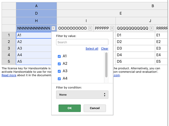
Currently, when you enable dropdownmenu on the grid, the header text overlaps with the dropdown menu icon, which looks really bad. Is there a way so the header text just truncates before the menu icon?
Anyway to truncate header text to not overlap with dropdownmenu icon?
Hey @mhennessy7
please follow this issue for updates https://github.com/handsontable/handsontable/issues/5782
The issue is in the backlog. I hope that we will be able to see this fixed in no time. I wil update you once we publish the fix.
Hi @mhennessy7
It has been a while, but I have good news.
The following issue is no longer replicable. I tested it out on every major browser.
1 Like
