I’m getting few weird formatting issues:
For example, one species of table is loading like this. My code base is fairly complicated, but here’s the crux:
table = new Handsontable(document.getElementById('table'), {
			data,
			licenseKey: 'non-commercial-and-evaluation',
			colHeaders: columnHeaders.concat(['Actions']),
			rowHeaders: function (index) {
				return data[index].id;
			},
			stretchH: 'all',
			columns,
			hiddenColumns: {
				columns: hiddenColumns
			},
			search: true,
			dropdownMenu: true,
			filters: true,
			afterChange: function (changes, source) {
				// don't save loading of data
				if (source === 'loadData') {
					return;
				}
				// in case of bulk changes
				for (let change of changes) {
					const [row, property, oldValue, value] = change;
					if (property === 'comments' && oldValue !== value) {
						document.getElementById(`${table.getRowHeader(row)}-comments-return`).value = value;
					}
				}
			}
		});
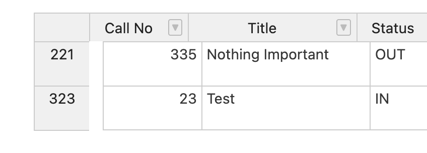
Sorry for formatting. If you’d like more detail about the values there, please let me know. Now, here’s what I get. Why’s the gap between the row header and first column there? FYI, the first column is always hidden.
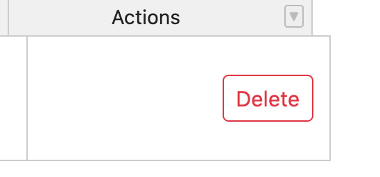
Finally, this thing: why is the button appearing at the right and the cell enlarged? Code:
function actionButtons(instance, td, row, col, prop, value, cellProperties) {
			Handsontable.renderers.TextRenderer.apply(this, arguments);
			td.innerHTML = `
				<div class="btn-group btn-group-sm p-1 mx-auto" role="group">
					${
						data[row].returned_at === 'NA'
							? `<button type="submit" class="btn btn-outline-success" form="${data[row].id}-return-form">Return</button>`
							: ''
					}
					<button type="submit" class="btn btn-outline-danger" form="${
						data[row].id
					}-delete-form">Delete</button>
				</div>
			`;
		}
		columns = columns
			.map(({ id }) => ({ data: id, editor: id === 'comments' && 'text' }))
			.concat({
				renderer: actionButtons,
				readOnly: true,
				className: 'htCenter'
			});

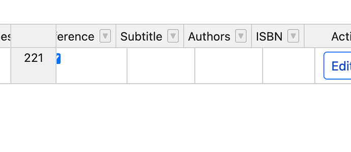
And sliding through the rows result in the row header sliding, which isn’t what I want:
Also, the default UI is not great - is there any way to improve it?
That said, I think Handsontable is an awesome and really useful piece of software! Thanks!

